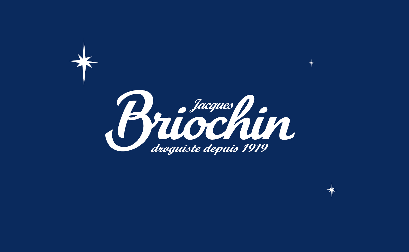
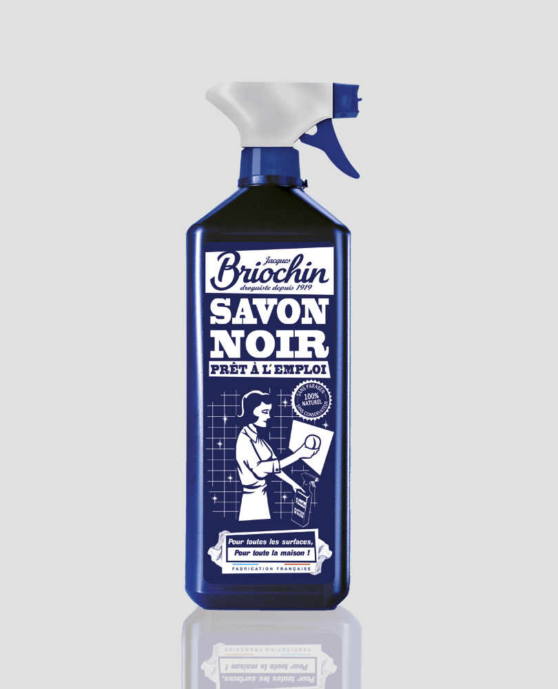
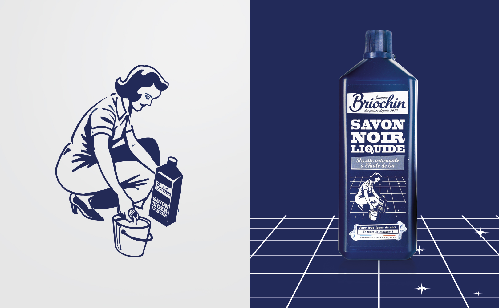
Briochin
Branding

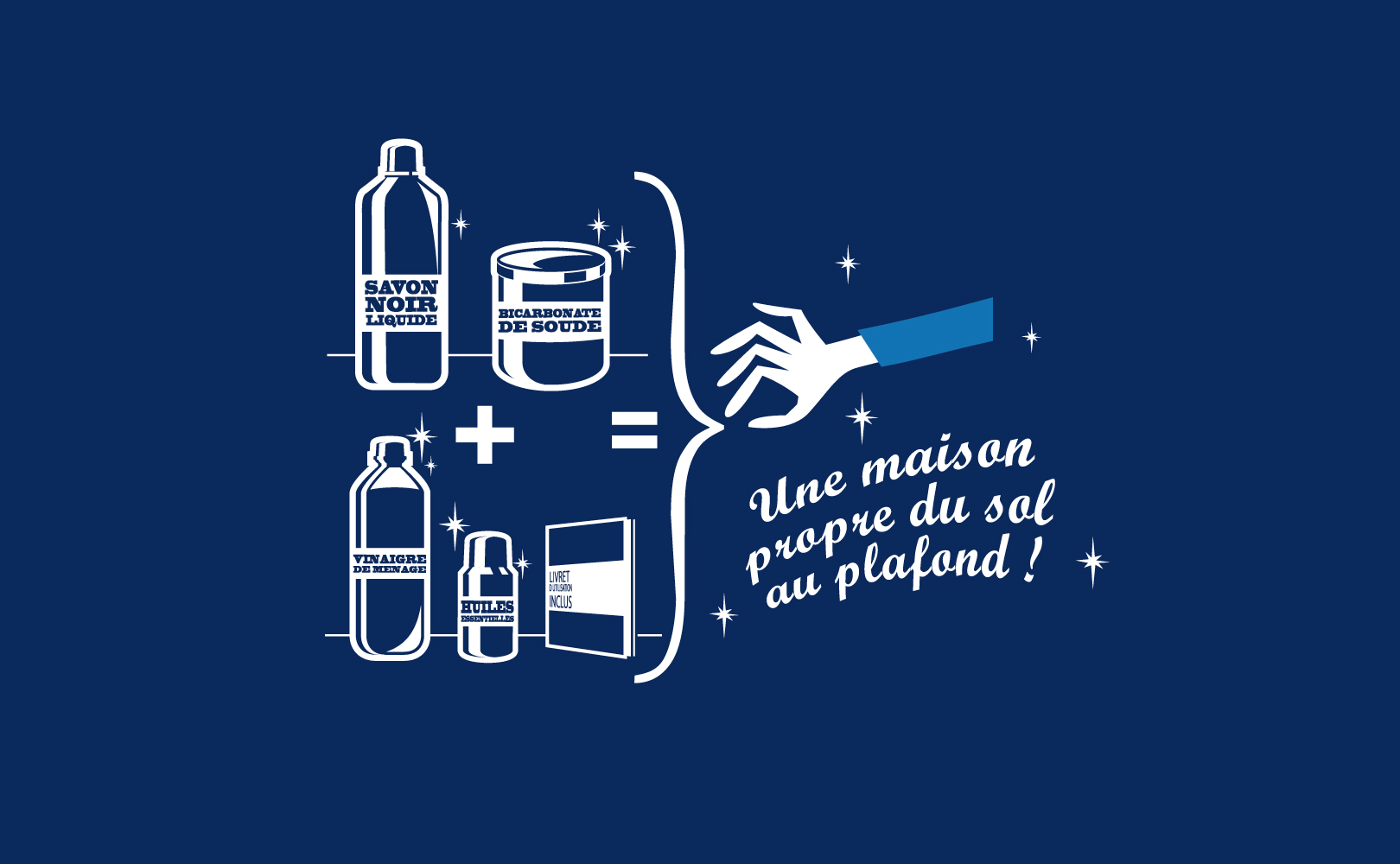
It's clean !
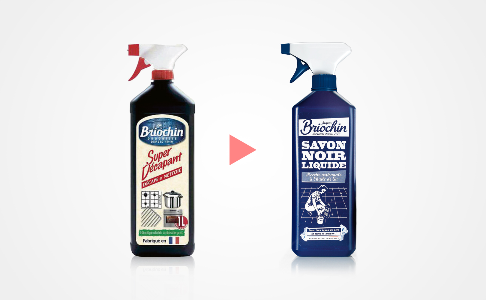
Stake :Reversing the steam and replace the deference of this brand "Made in France" by a redesign in a shape of an explosion.
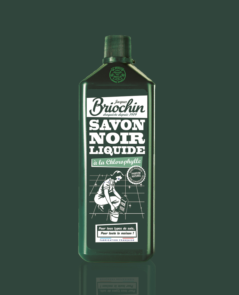
Answer : An identity that leans onto the historical character and professional of the brand in order to create an off-beat tone that is extremely modern in the kitschy spirit of the "domestic arts", with the black soap that became the brand's icon, in the centre of the product line. How clean !
- Briochin
- Branding, Packaging
- Packaging / Brand Platform / Logo
- Briochin website